What Is a Third World Country?
July 11th, 2017
Share: ![]()
![]()
![]()
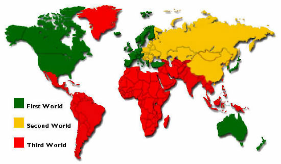
I was having a conversation with some friends about the distinctions between so-called “First World” and “Third World” nations. I had a hunch that this categorization seemed a little outdated, and a look into the history of the terms confirmed my suspicions. The terminology was invented during the Cold War to describe allegiances. The “Third World” referred to the three quarters of the world at the time which hadn’t aligned with etiher empire. This categorization is practically useless for any sort of demographic or economic comparison, as the Third World places countries like Greenland, Venezuela, and Saudi Arabia under the same umbrella.
A better categorization is based on rankings by the Human Development Index (HDI), which is a measure of quality of life indicators such as life expectancy, education, and income per capita. The system, developed by the United Nations, seems at first glance to be a bit-more data-centric than the previous scheme. But nevertheless, many have argued that the cut-off points seem arbitrary, and that the data did not take into account inequality (note, as you will soon see, neither will my data, at least not explicitly). As an aside, the ongoing national debate over the Stephen Miller-penned speech by Donald Trump in Warsaw, got me thinking about these sorts of categorizations. In that speech, Trump pitted “Western” civilization against barbarians at its opponents. There were some sort of ethno-nationalistic undertones (overtones?) in that speech, and I wondered if such a category was even borne out by the data in the first place.

In short, I had some free time, and I was ready to try my hand and see if I could do better, or at least come up with a rudimentary scheme with an easily interpretable meaning. I’ll discuss the shortcomings of my admittedly unsophisticated method in the next section.
Part 2: The Data
The dataset comes from the indicators which are tracked by the World Bank, which I will refer to as features. The reason behind picking this dataset is that it seemed reasonably consistent and fairly diverse in features. You can check out the full list of indicators here. There were, however, a few problems with the data.
Some nations had more recently updated data than others. I didn’t look too much into the data collection methods themselves, but from what I was able to find there was a non-negligible amount of error present in the data. Most importantly, the data was missing for a lot of countries. I restricted the features to only features which had data for 80% of countries, and then only countries which had data for 85% of the features. Admittedly, these numbers were pretty arbitrary. I replaced the remaining missing values for every index with the mean value of the feature. Finally, I regularized the data (meaning scaled all the data linearly to a range between 0 and 1, with 0 being the smallest value and 1 the highest).
There are a lot of problems with this approach. First of all, the data wasn’t perfect, but I don’t think it ever is, so maybe that’s not the biggest issue. The biggest issue is that with this approach,I assume that there is some sort of linear relationship between these nations and the features.
More concretely, I assumed that we could derive a “label” for each country as a linear function of the features we picked. If you don’t know what a linear function is, don’t worry about; suffice it to say that a linear function is just a very convenient kind of function that pretty much everyone likes working with instead of non-linear functions. The great things about are encoded by 2 dimensional arrays called matrices. For example, I could have instead scaled each feature using a sigmoid function (which more clearly delinates between the two ends of the range).
The method I used to categorize the countries by features also took a “linear” approach, imagining the countries in an abstract higher-dimensional space where the $x$-coordinate, for example, represented GDP per capita, and the $y$-coordinate represented lifespan, and so on. I could have used a neural network approach instead, which does not operate on this hypothesis. Linear models, however, are really easy to build, so that’s what I went with.
What I discovered is that there are are no “right” or “wrong” answers when dealing with this kind of problem. This is an example of what is known in the machine-learning lingo as “unsupervised learning”, a problem where there are no right answers and so the algorithm develops its solution regardless of any pre-conceived “labels”. If there was an objective way to classify these data points, I would train the algorithm to predict the correct classification. But there wasn’t. So I was on my own.
Part 3: The $k$-Means Clustering Algorithm
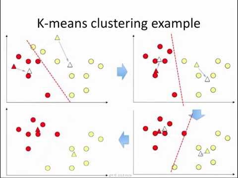
A common approach to this sort of problem is the $k$-means clustering algorithm. Once we have mapped out our countries according to their features (we’ll get to that in a minute), we can treat them as points in a higher dimensional space which is not necessarily easy to visualize. The $k$-means algorithm then simply groups the points into $k$ groups in that space. More concretely, the algorithm finds $k$ suitable center points, and a point is labeled according to which center point is the closest. Obvious questions that you may ask are: firstly, how do you determine $k$; and secondly, what does “closest” mean?
One of the great things about this approach is that the standard algorithm is incredibly simple (although I didn’t implement it myself). I might make a blog post about it at some point. The basic idea (a solution called Lloyd’s Algorithm) is to begin by picking a bunch of random centers and cluster our points (nations) according to the nearest center. Then, find the middle of each cluster of nation/points (take the average) and create a new set of $k$ clusters. Finally, repeat the previous step, clustering points according to these new centers.
It isn’t hard to prove that the algorithm eventually terminates, reaching what is called a local optimum, although you are free to stop the algorithm after a certain number of iterations. The algorithm may not always find the most optimal solution (in fact, it’s pretty much impossible as the problem is $NP$-Hard, whatever that means); however, at each step it improves its “score” (the average distance between a point and the center of its cluster), so at some point it stops.
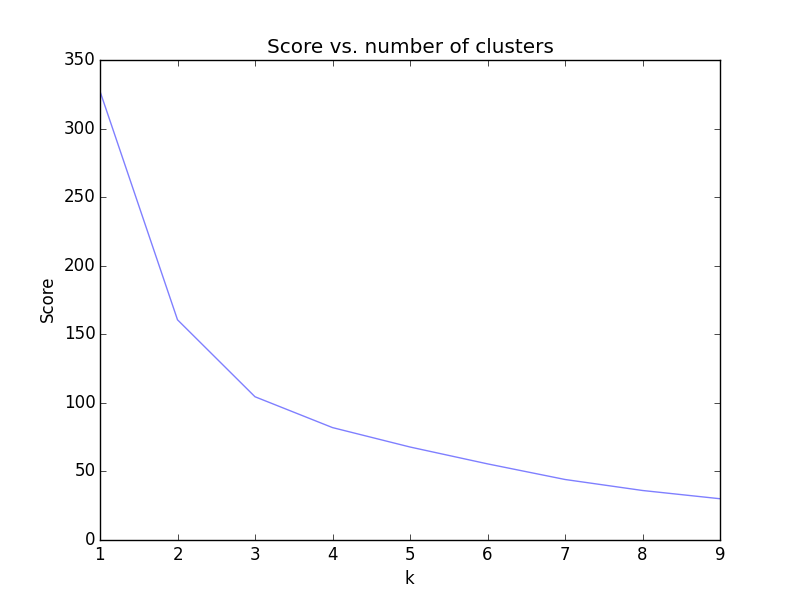
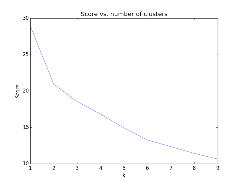
So how do we pick $k$? Well luckily, it’s fairly easy to see in most cases. We’ll try picking $k$ from $1$ to $20$ and map the “score”, which is the sum of the squared distances from each point to the center of its cluster. You’ll be able to see in most cases that there is a point at which you’re not going to do much better. If you think about it, you could keep going until each point is in its own cluster, but that wouldn’t be too fruitful, so we’ll settle for a local optimum. The most common way to find this point is the “elbow test” – when you see a point in the data where there is an “elbow” in the graph, you know where to stop.
Part 4, Or, The Real Distance Between Finland and Bahrain
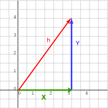
Now we come to the hardest part of this whole approach: what exactly does distance mean in our abstract higher-dimensional space? Recall that we graph each nation according to various axes corresponding to World Bank Indicators, along which it has values between $0$ and $1$. So the distance is measured by something like the Pythagorean Theorem. In essence, we draw the straight line between two points, draw a higher dimensional “triangle” by drawing altitudes to each axis, and measure the side’s length using the Pythagorean Theorem, and call that the distance between the two points.
But there’s a major problem with this approach. Our features have a LOT of overlap. For example, the World Bank measures both the percentage of the population with access to electricity as well as the time required to get electricity, and you might suspect those two are pretty closely related. So any distance between Finland and Bahrain, for example, depends almost twice as much on this kind of data than any other kind of data which is onyl tracked once. So how can we eliminate this sort of double counting?
Well, remember our $k$-means clustering algorithm? We can use this algorithm to group countries by features. But we can also use it to group features by countries, where two indicators are considered close together if they agree for a lot of countries. We can use this to get a picture of what kinds of features are close together. This approach may actually be better, since there are far more countries than features. But we don’t have to look at every single country to cluster features together; we only have to look at the ones which differentiate the most.
Part 5, Or, The Ideal Nation
It doesn’t really make sense to consider all 200-something countries in our dataset to group the features. For one, there are probably some outliers in the dataset, otherwise similar countries which vary wildly with respect to, say, alcohol consumption per capita (looking at you, Czech Republic). So we want to pick “ideal” nations (nothing political here), so that looking at only those nations, we get as much data as possible. We’re not limited to looking at the values of any one country. For example, we could create an “ideal” nation which is $5\times \text{Sweden} - \text{Japan}$. This is a technique called principal component analysis (PCA), and it sometimes leads to results that are hard to interpret. Take a look at this New York Times article which plots 18th and 19th century British novels against “ideal” words to differentiate clusters of books; even for the NYT, it’s sometimes hard to explain intuitively what exactly our axes mean. If you took linear algebra and statistics, you can understand the result as follows: the axes are simply the eigenvectors of the covariance matrix ranked according to their eigenvalues.
In any case, I grouped the features according to “ideal” nations, adding in successively less important ideal nations until I had covered about 85% of the total variance in the original data. It turns out I only needed $3$ ideal countries to do this. Finally, I clustered the features along the nations to get an idea of which features were the most similar across countries. The picture you see below is two dimensional, because I picked the two most “important” ideal countries for visualization purposes.
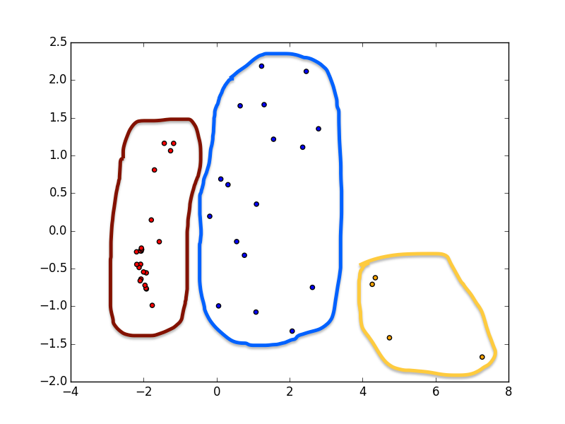
So what do the clusters look like? Well, let me attempt to find some sort of interpretation of each.
Red: Growth
This is an interesting group of features. It measures a number of features which group into our idea of pollution and energy consumption (air pollution, carbon and nitrous oxide emissions, gas fuel consumptino). However, whereas the blue features measured the total amounts of these factors, the green features tend to measure these factors as a percentage of a total. Interestingly, renewable energy consumption as a percentage of total energy consumption is high as well, as well as renewable electricity output. There’s also a feature measuring the mortality caused by road traffic, and a feature measuring travel and transport services, suggesting a busy and congested transportation system.
Finally, we also have a feature measuring the relative population of the country’s largest city, which pairs along with urban population growth. These two features suggest a quickly growing and urbanizing nation, with a huge capital city or hub driving growth. I’m sure we all can think of a few cities like this, so it makes sense that these features are grouped together.
There’s also the prevalence of anemia amongst women and children. Not sure what that’s about, but the link definitely exists. The highest rates of anemia are all in sub-Saharan Africa, which also scores high on a lot of these other features.
This group is a bit different than the yellow “urbanization” group. You can imagine some urbanized nations which are not necessarily growing, but are perhaps already fully grown. You might want to group these features as tracking urban development from phases of building basic amenities to rapid growth to outstanding technological capacity. But that might be a bit much.
Yellow: Urbanization
On the one hand, there are two features related to gas prices (pump price for gasoline and diesel fuel). There’s also the urban population as a percentage of the total, which makes sense as a connection to gas prices. Finally, there’s the percentage of the urban population with access to improved sanitation. It makes sense that each of these is a fairly good predictor of the others.
Blue: Technology
This one is hard to qualify, as there are several subgroups.
The first subgroup has to do with natural resources: revenue from these resources, their depletion and consumption, total carbon and nitrous oxide emissions, and total methane emissions. We can loosely refer to these factors as “natural resource consumption”.
There’s also a subgroup of features measuring urban population and land area, suggesting the reasonable hypothesis that urban population is linked to energy consumption and such.
There’s also a group of features related to imports, suggesting that these sorts of urban, natural-resource rich nations also have a thriving trade economy.
Finally, there’s two more features which don’t seem to fit in with the rest philosophically, but fit in very well mathematically. The first is the outflow foreign investments, and the second is the number of scientific and technical journal articles.
These four subgroups paint a picture of what is, in my opinion, a highly technologically advanced nation: an outsize carbon footprint, a huge urban population, and an economy that depends on globalization. This is why I’ve decided to call this a group of features related to “technology”.
Part 6, Or, Feature Selection is Hard
So finally, we have an idea as to how we can built a meaningful grouping of nations by three relatively distinct factors. I decided to take two or three features from each cluster to add some variation.
This is where I realized that this entire activity is pointless without a specific goal in mind. I decided to weight all the types of features more or less by equally, but someone with different political goals in mind could end up with a completely different list. When you’re judging nations on the basis of GDP, human rights violations, ethnic diversity, carbon emissions, or scientific contributions, you can end up with all sorts of different metrics. An unsupervised approach does not work at this particular task, which makes it not a great fit for machine learning.
Important Note
It is important to realize that data bears the mark of human bias. Beware when using machine learning that it does not necessarily further goals of equality of any sort or social justice. A computer is never wrong; it simply does what you tell it to do.
Part 7: The Final Results
Finally, we use $k$-means again to group our countries by the 12 features we selected. First, we do an “elbow plot”:
Keep in mind we’re working in 12-dimensional space. For the purposes of visualization, I projected the clusters down into two dimensional space so we could take a look at them. If you hover over each dot, you can see the country corresponding to it (note: the Pacific island small states are all grouped as one nation to make the data easier to work with; sorry, Guam).
This is a projection into two dimensional space, but nevertheless it more or less gets the image. So what can we say about our clusters? Well, some interesting points came out of this. One is that China and the US are both kind of on their own, probably because of extremely high scientific journal output and methane emissions. Most of Europe is in the green cluster, along with Japan, Russia, Canada and Australia. The orange cluster contains some bordering pairs of states (Saudi Arabia & Qatar, Iraq & Kuwait, Algeria and Liberia), must mostly seems to be kind of a “miscellaneous” category. Blue seems to contain a large chunk of Southeast Asia, East Africa, and Central America, as well as India off on its own.
My main takeaway here, though, is that the clusters are difficult to find and, to a certain extent, are arbitrary depending on your metrics. These clusters don’t just pop out of the data; by choosing different features (I tried a few combinations), you get a substantially different picture of what countries are close to each other. Methodology is incredibly important when creating such a system. So while I don’t necessarily agree with the methods of, say, the Human Development Index, I can now at least understand where they were coming from.
That’s it for this post. Feel free to check out the code on Github.
Share this on:
Recent Posts
- A Note on the Variation of Parameters Method | 11/01/17
- Group Theory, Part 3: Direct and Semidirect Products | 10/26/17
- Galois Theory, Part 1: The Fundamental Theorem of Galois Theory | 10/19/17
- Field Theory, Part 2: Splitting Fields; Algebraic Closure | 10/19/17
- Field Theory, Part 1: Basic Theory and Algebraic Extensions | 10/18/17